Putting Data In Perspective with Streaming Graph
Africa is bigger than Greenland. A LOT bigger! You already knew that—but you also know that the world is round. When you try to show a globe on a flap map, you have to distort the original shape of some parts of the globe. Depending on where you start, different parts of the map will be distorted by different degrees. This is why a Mercator Projection of the Earth shows Africa and Greenland appearing about the same size. If you live in Europe or the United States, your region probably seems about right. If you only need to focus on a small area, flat maps are very useful! However when you need a global perspective, they are impossibly broken.

Mercator Projection, Courtesy of Daniel R. Strebe
We face the same problem when using data to understand complex systems. Data comes from one source, one vendor, or one engineer’s guess about what needs to be seen and is convenient to collect. When it works well, it gives us something like a flat map that is helpful to understand a small area that is part of a complex system. If you try to use that perspective to understand the system as a whole, the end result is grossly distorted!
This problem emerges on virtually all kinds of complex systems. CDN logs can help shed light on real-time video delivery across the internet, but dramatically obscure the quality of experience each of a million viewers is having. Monitoring file access logs can help understand security events in a live computer system, but does little to learn about injected shell code. Counting twitter followers might show you who the “influencers” are, but tells you little about the swelling revolution.
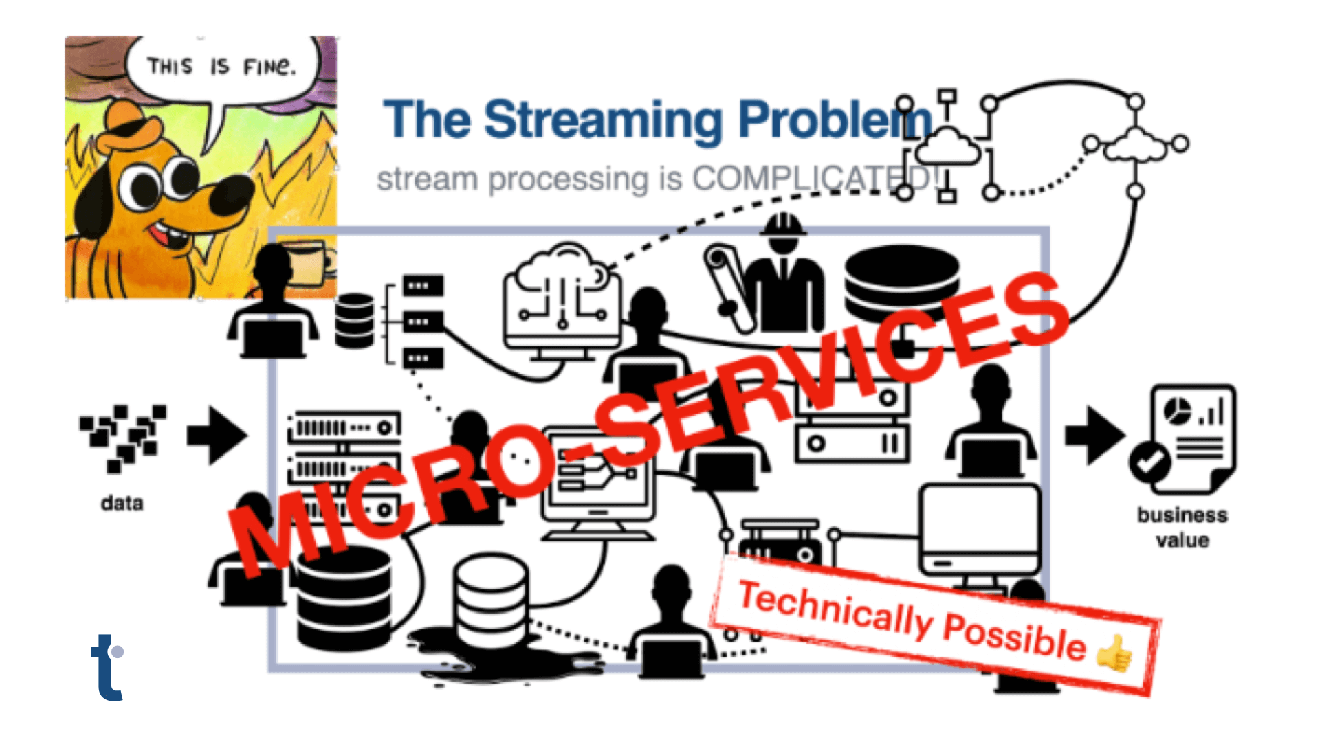
The tendency of data engineers and analysts is to convert the complexity of these data sources into many “metrics” that show counts over time for dozens of possible measurements. This converts each digital signal into one compound analog chart, and the hope is that important events will result in a spike or a dip in one of those charts… and that the analyst will be able to explain what the spike means when it recurs. This approach is cumbersome, error prone, and requires constant vigilance by experts. But there is a better way.
To understand a complex system from its data requires leaving the simplified world of flat data metrics and building a 3D model of the system’s data—use data to build a globe, instead of a map. This three dimensional model will allow you to see the system from every angle and correctly view the whole world. We have distilled this process down into three main principles for building 3D data.
1. Draw connections between data.
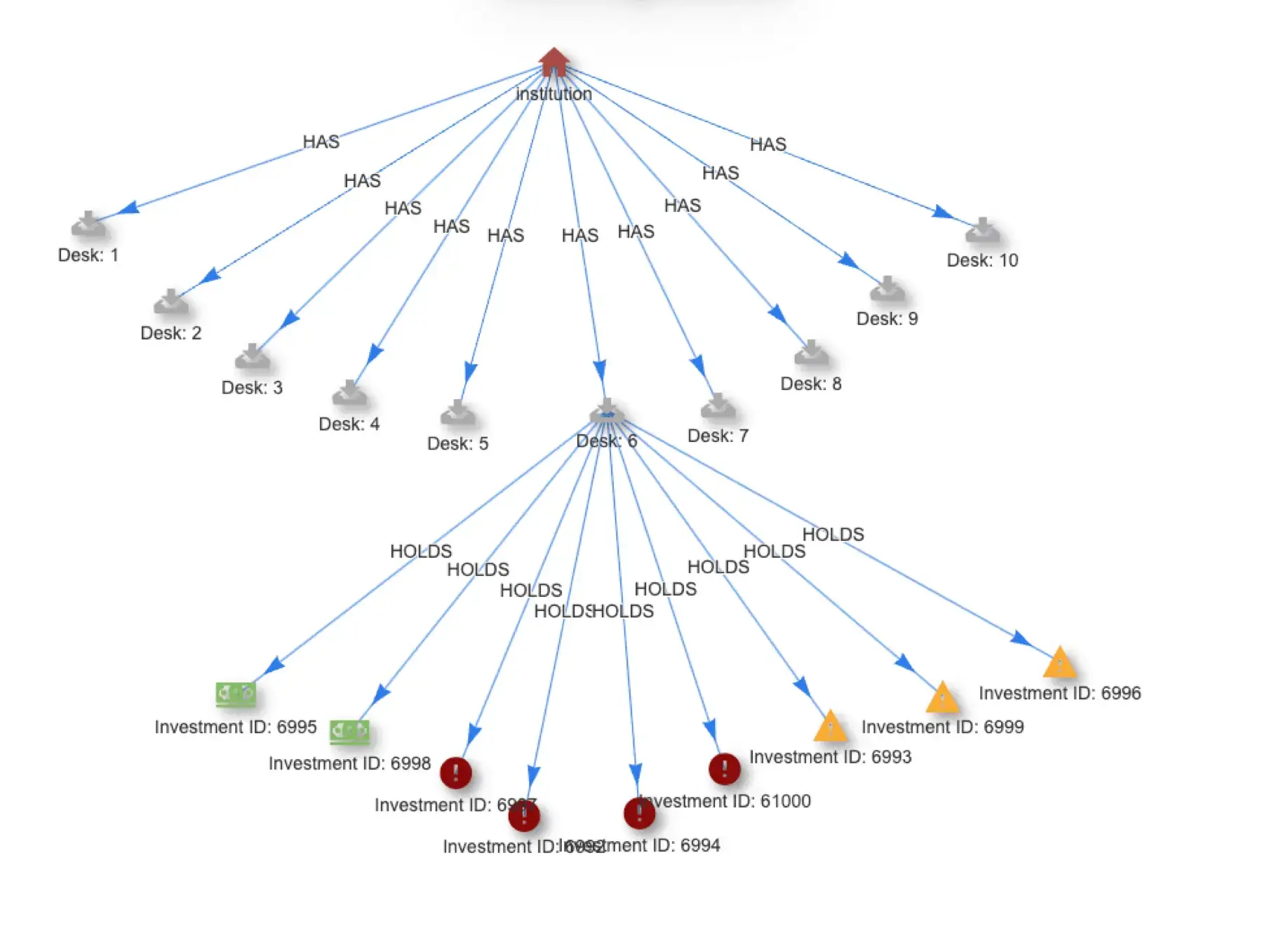
Data should come from many different sources. Pull it into the same system so that you can connect elements in one set to the others. You will not have all possible data at the beginning, so you cannot know what the ideal data schema is. Accept that and use a system which will let you draw connections between data items over time and create new associations that weren’t obvious at the beginning. There are many ways to connect the dots. Allow for them all to be represented in the data—you won’t always know which are most valuable until the end.
2. Define new levels of data.
Deliberately build new data elements. Build them out of other data elements. Decide what a pattern of events means, and create a new data element to represent that meaningful object. Be sure to connect the new objects to the data they were produced from as well as any other data that produces a possibly useful connection. Arrange any items which have a useful order; record every order that could be useful. Build beyond a single level; after considering what new object is made of many lower-level details, do it again and consider how many of those objects can be combined to make an even more meaningful object. Building up at each level will result in fewer data elements at that level, but each of them being more meaningful—and closer to the actual questions you want to answer. Building up from low-level data into increasingly abstract data levels is what produces 3D data needed to answer complex questions.
3. Drill down to answer questions.
3D data directly answers human-level questions at its highest points. Literally. There is a piece of data, built from other data, that says “yes” or “no” to a question like: “Is this video stream high quality?” If the answer is “no,” drill down and look at the data used to build this last level to start explaining why? If you need more detail, keep drilling down to lower levels of data. Answering new questions is a matter of defining new data combinations that build toward literally providing that answer. There isn’t a privileged perspective or one single “right” way to look at the data. Build every useful abstraction toward every question you want to answer.
This view of 3D Data builds upon current practices and is also revolutionary in its power! We believe this so strongly that we’ve built a streaming data processing system to do 3D Data processing in real-time on a massive scale. At thatDot, our mission is to turn high-volume data into high-value data. This framework for 3D Data processing is how we do it.