Monitoring Data in Motion
There has been a significant increase in the popularity of event streaming and stream processing applications/technologies within the data engineering community. With the accelerating growth of big data, IoT, and cloud computing, more organizations are facing the challenge of extracting actionable insights earlier in the event pipeline. For historical reasons, operational tools for monitoring, alerting, and diagnosing system issues are oriented toward data at rest. That doesn’t mean they can’t be just as useful for monitoring data in motion. It just means adjusting your monitoring regime to a streaming mindset.
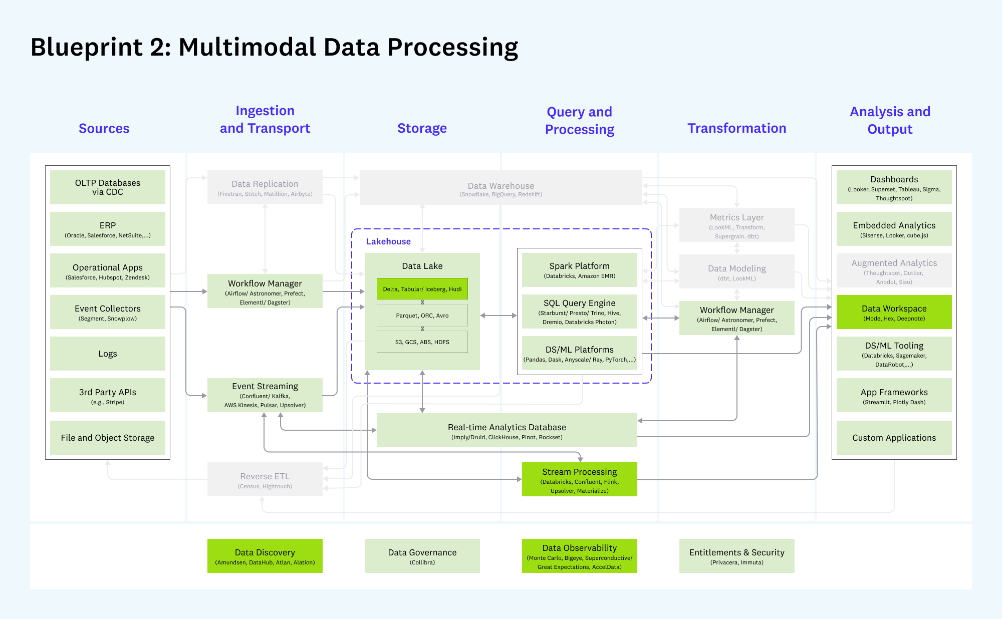
From Emerging Architectures for Modern Data Infrastructure – Andreessen Horowitz
NOTE
Darker boxes indicate new or meaningfully changed categories since v1 of the architecture in 2020; lighter colored boxes indicate categories that have largely remained unchanged. Gray boxes are considered less relevant to this blueprint.
A good example of a next-gen streaming infrastructure element is Quine. Quine is an event streaming technology designed to process graph-shaped event streams and produce high-value events in real time.
In this blog post, we’ll guide you through setting up Grafana backed by InfluxDB to monitor a Quine instance. We’ll show you how to configure Quine to send data to InfluxDB, create a dashboard in Grafana to visualize this data, and use Grafana’s powerful features to detect issues and anomalies in real time. By the end of this post, you’ll have a solid understanding of how to monitor event stream pipelines using Grafana and InfluxDB, and you’ll be equipped with the tools and knowledge needed to keep Quine running smoothly.
Setting up Grafana and InfluxDB
Grafana is a tool that helps you visualize and understand operational metrics data. It lets you create visual dashboards to monitor and analyze data from sources across your data infrastructure. DevOps teams use Grafana metrics dashboards to make informed decisions.
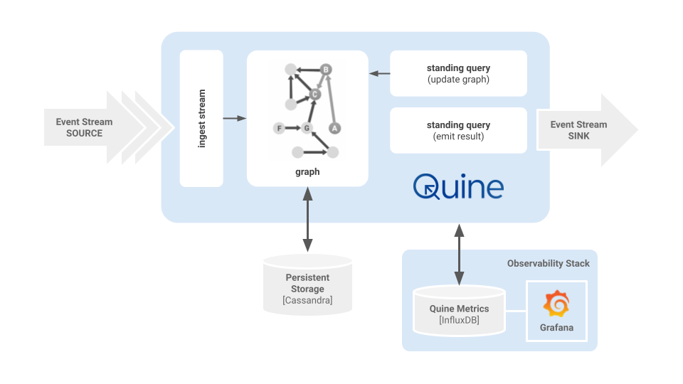
Above is an example of my typical development and testing environment when working on a recipe. The event sources and output sinks change depending on the scenario, but most of the time, I run Quine on my local host, configured to push metrics to InfluxDB and visualize the observations in Grafana. Using Docker containers makes it easy to configure and clean up my environment quickly.
We need to do a little pre-work before launching the Docker containers. This is how I set up my environment using docker-compose. You may do things differently based on how Docker is installed on your host.
I like to keep docker-compose.yaml files arranged inside their directories in a docker directory that lives in $HOME. This helps me keep things organized and makes sharing configs between my MacOS laptop and Ubuntu servers easy.
I created a zip file of my config to download and use with the blog post.
cd $HOME
wget https://quine-recipe-public.s3.us-west-2.amazonaws.com/quine-grafana-docker.zip
unzip quine-grafana-docker.zip

Archive:  quine-docker.zip
  inflating: docker/cassandra/docker-compose.yaml
  inflating: docker/grafana/docker-compose.yaml
   creating: docker/grafana/grafana-provisioning/
   creating: docker/grafana/grafana-provisioning/datasources/
  inflating: docker/grafana/grafana-provisioning/datasources/datasource.yml
   creating: docker/grafana/grafana-provisioning/dashboards/
  inflating: docker/grafana/grafana-provisioning/dashboards/quine.json
  inflating: docker/grafana/grafana-provisioning/dashboards/dashboard.yaml
NOTE
I included a docker-compose file for Cassandra in the zip archive. I won’t cover the Cassandra config in this article. The file is included as a reference if you choose to separate your persistent storage from the application to keep from competing for server resources. See the Cassandra Persistor docs for a sample configuration file.
You now have this directory structure in your $HOME dir.
docker
├── cassandra
│   └── docker-compose.yaml
└── grafana
    ├── docker-compose.yaml
    └── grafana-provisioning
        ├── dashboards
        │   ├── dashboard.yaml
        │   └── quine.json
        └── datasources
            └── datasource.yml
With Docker configured and the quine-docker.zip files loaded on your virtualization host, it’s time to start the containers so that they are ready to receive data from Quine.
Change into the grafana directory and start the InfluxDB/Grafana stack:
docker compose up -d
You should see something similar to this appear in your terminal window:
[+] Running 18/18
 ⠿ grafana Pulled                                            8.7s
   ⠿ f56be85fc22e Pull complete                              2.8s
   ⠿ 9efeca377709 Pull complete                              3.0s
   ⠿ b4608283f0dd Pull complete                              3.5s
   ⠿ 94ba646ecfcd Pull complete                              3.9s
   ⠿ 6730f2b3d4cf Pull complete                              4.1s
   ⠿ 871e090050be Pull complete                              4.4s
   ⠿ 03d60ad4c029 Pull complete                              5.7s
   ⠿ baaa3e79bf5c Pull complete                              7.6s
   ⠿ 01c0c058d3df Pull complete                              7.7s
 ⠿ influxdb Pulled                                           9.6s
   ⠿ 918547b94326 Pull complete                              7.4s
   ⠿ 5d79063a01c5 Pull complete                              7.7s
   ⠿ a8e9798c2a3f Pull complete                              7.8s
   ⠿ e8074b4fc936 Pull complete                              8.5s
   ⠿ a913b4722330 Pull complete                              8.5s
   ⠿ 9c8265b2cf7a Pull complete                              8.6s
   ⠿ 9037f1aeb9df Pull complete                              8.6s
[+] Running 4/4
 ⠿ Volume "grafana_grafana-storage"   Created                0.0s
 ⠿ Volume "grafana_influxdb-storage"  Created                0.0s
 ⠿ Container grafana-influxdb-1       Started                0.5s
 ⠿ Container grafana-grafana-1        Started                0.7s
Verify that the containers are running:

docker ps --format "table {{.Names}}\t{{.Status}}\t{{.Ports}}"
NAMES                 STATUS           PORTS
grafana-grafana-1     Up 4 seconds     0.0.0.0:3000->3000/tcp
grafana-influxdb-1    Up 4 seconds     0.0.0.0:8086->8086/tcp
Congratulations! 🎉 InfluxDB, Grafana, and Cassandra are running in separate containers and listening on their default ports.
Configuring Quine to Send Metrics Data
Enable metrics reporting in Quine via configuration parameters that can be passed as Java system properties with -D or contained in a Quine configuration file. Quine can report metrics to jmx, csv, influxdb, and slf4j for analysis. The jmx metrics reporter is enabled by default.
java \
    -Xmx12G -Xms12G \
    -Dquine.metrics-reporters.1.type=influxdb \
    -Dquine.metrics-reporters.1.database=db0 \
    -Dquine.metrics-reporters.1.period=30s \
    -Dquine.metrics-reporters.1.host={container_host} \
    -jar quine-1.5.4.jar \
    -r wikipedia --force-config
A couple of things to note when passing configuration as system properties.
- The
-Dparameters must come before-jar - When launching Quine with a recipe (
-r) you also have to pass--force-config
Alternatively, you can pass the following configuration stored in quine-metrics.conf to Quine to accomplish the same thing.
Create a quine-metrics.conf file containing the HOCON configuration from the documentation.
quine {
  # where metrics collected by the application should be reported
  metrics-reporters = [
    {
      # Report metrics to an influxdb (version 1) database
      type = influxdb

      # required by influxdb - the interval at which new records will
      # be written to the database
      period = 30

      # Connection information for the influxdb database
      database = db0
      scheme = http
      host = {container_host}
      port = 8086

      # Authentication information for the influxdb database. Both
      # fields may be omitted
      # user = admin
      # password = admin
    }
  ]
}
Then launch Quine, passing the configuration file on the command line.
java -Dconfig.file=metrics.conf -jar quine-1.5.4.jar -r wikipedia --force-config
Quine Metrics
Quine reports three classes of metrics; counters, timers, and gauges.
TIP!
When queried, the metrics summary API endpoint reports the same metrics as a metrics reporter.
Counters
Quine uses counters to accumulate the number of times that events occur. Counters can return either a value or a histogram.
node.edge-counts.*: Histogram-style summaries of edges per nodenode.property-counts.*: Histogram-style summaries of properties per nodeshard.*.sleep-counters: Count the lifecycle state of nodes managed by a shard
Timers
Quine reports the elapsed time in milliseconds it takes to perform persistor operations.
persistor.get-journal: Time taken to read and deserialize a single node’s relevant journalpersistor.persist-event: Time taken to serialize and persist one message’s worth of on-node eventspersistor.get-latest-snapshot: Time taken to read (but not deserialize) a single node snapshot
Gauges
Quine gauges report metrics as a value.
memory.heap.*: JVM heap usagememory.total: JVM combined memory usageshared.valve.ingest: Number of current requests to slow ingest for another part of Quine to catch updgn-reg.count: Number of in-memory registered DomainGraphNodes
Create a Dashboard in Grafana
A dashboard in Grafana contains a series of panels that provide an at-a-glance view of how Quine is performing.
- Log into Grafana. The username and password for the container is admin:admin.
- Decide if you are going to keep the default password or skip changing it
If you launched Grafana using the docker-compose files from the quine-docker.zip file that I provided, you will see a dashboard called “Quine – Monitor a Recipe” in the lower left hand corner of the Dashboards card. Click on that dashboard to open it. Initially, the dashboard will be empty. It will fill in as you run a recipe.
Let’s start Quine with the Wikipedia recipe and the metrics.conf file from above to get familiar with each visualization.
java -Dconfig.file=metrics.conf -jar quine-1.5.4.jar -r wikipedia --force-config
Metrics will populate the dashboard after about 30 seconds once Quine is running. You may need to reload your browser to have Grafana pull all of the metrics from InfluxDB. Also, be sure to set the time range in the upper right corner of the dashboard to “Last 15 minutes” to ensure that you have a current time range selected to visualize.
Your dashboard will begin to populate like this:
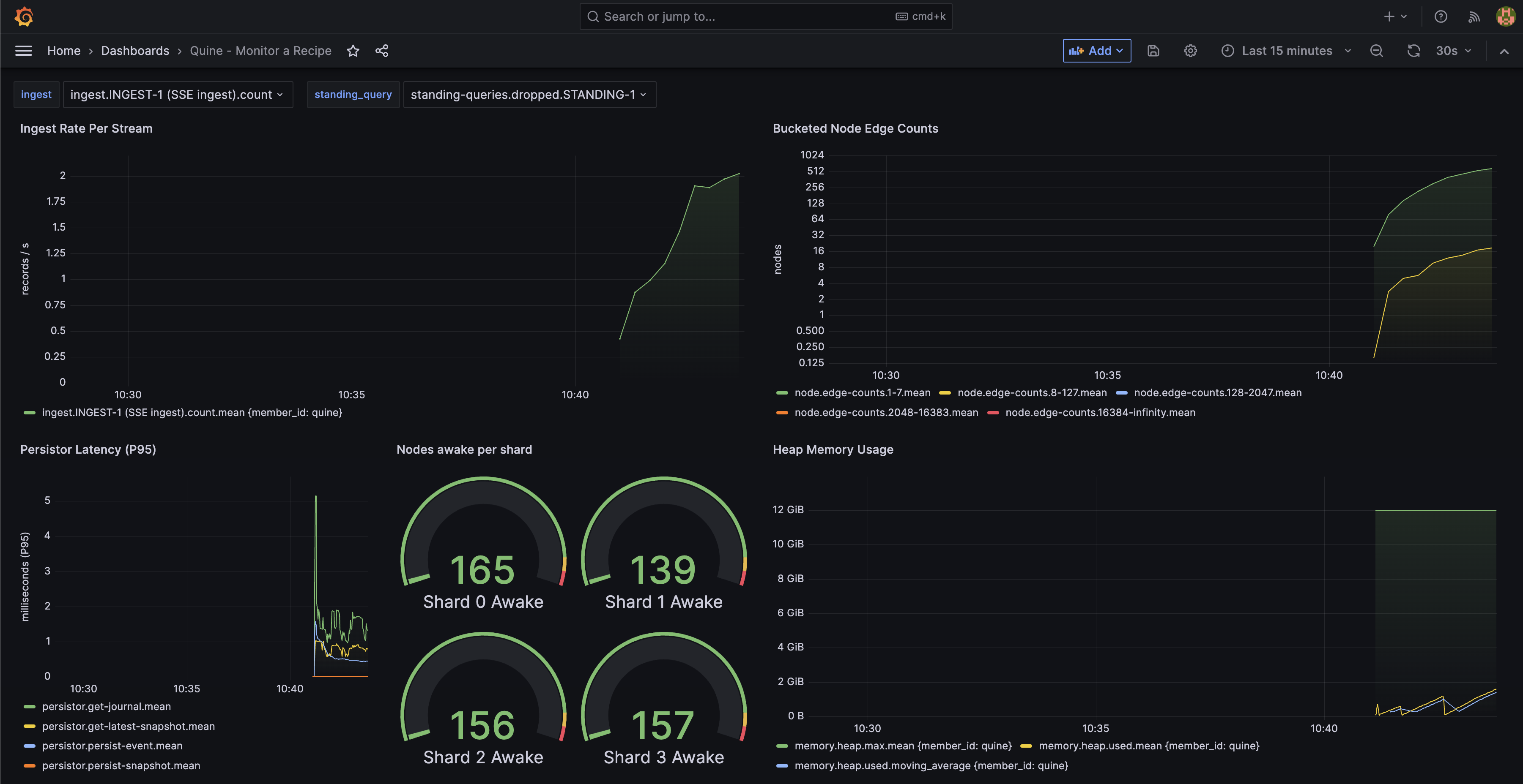
A Grafana dashboard view for Quine running the Wikipedia ingest recipe.
Hover over each graph in the dashboard to expose a “three-dot” menu in the upper right hand corner of the panel. Click on the menu and select “edit” to review how each visualization is configured. Some visualizations use the query builder, and some are written directly as an InfluxDB query.
Please modify the dashboard to match your environment and satisfy your needs.
What I’ve Learned Monitoring Quine
Monitoring a streaming graph is similar to any other database, with a few additional key metrics to watch.
- Quine is backpressured, which means that the performance of the persistence subsystem affects the flow of events in the graph.
- Java garbage collection impacts backpressure. It is normal for Quine ingest rates to fluctuate as Java manages the heap. Keep an eye on when your heap consumption approaches the max memory configured for Java. I’ve found the best performance when launching Quine with a 12G (
-Xmx12G -Xms12G) memory allocation pool.
Conclusion
The metrics dashboard built into the Exploration UI is good for understanding how Quine is currently operating. However, monitoring the performance of a recipe or solution over time requires a DevOps tool like Grafana. This blog will get you up and running with a sample dashboard that replicates all of the gauges in the Exploration UI that you can modify to suit your needs.